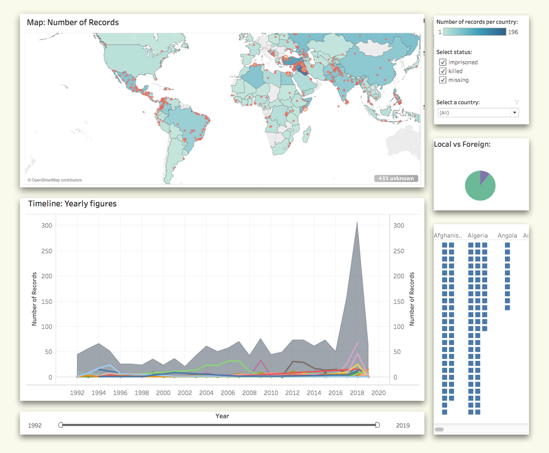
The visualisation provides a global snapshot of cases regarding killed, missing and imprisoned journalists.
Problem: Every year, hundreds of journalists are attacked, imprisoned, or killed. Such instances are recorded by the The Committee to Protect Journalists. Visualising such data can aid the understanding of free media obstruction.
Solution:The dashboard includes a map displaying country count and cases mapped to specified locations, a line graph displaying global and country data changes over time, and a bar graph which displays invidual data points grouped by countries. Interactive features provided allow to zoom into the data of interest, whereas tooltips display detailed records.
Role: Ideation, sketching, implementation.
Tools: Tabeau
DATA
The visualisation uses data published by The Committee to Protect Journalists and can be found here. It includes cases of journalists that have been killed, imprisoned or reported missing since 1992. The database is updated annually.
Prior to implementation, the data was cleaned and transformed with SQL and Tableau Prep.
USER GOAL AND QUESTIONS
The design of the visual assumes that the user's main goal is to discover the data, meaning for some trends and patterns, trying to generate and verify a hypothesis. Accordingly, visualisation enables users to answer open-ended questions, such as which countries have the highest journalist imprisoment rates, how events of interest effect the safety journalists, which countries are unsafe for foreign media to work in etc. The user goal and anticipated questions informed the design of the visualisation, its structure and interactive features.
In line with the user goal, the visualisation follows Shneiderman's data visualisation principle. First, it provides an overview of the data, helping users to orient themselves. Then, users can use time, country, category filters to zoom in on the data of their interest. More details can be accessed via tooltips.
ATTRIBUTE VISUAL ENCODING
All data attrubutes have been analysed and the most approapriate visual encoding channels have been identified in order to make the visualisation perceivable. Table on the right summarasises how the visual channels are justified.
| Data attribute | Attribute type | Visual encoding | Justification |
|---|---|---|---|
| Number of cases per country | Quantitative | Color saturation (map), and area size (bar graph consisting aligned squares), position on an aligned scale (line graph). | Expressive and efficient use of channels. |
| Number of cases per location | Quantitative | Color saturation and area size. | Expressive and efficient use of channels. |
| Time | Ordinal | Position on a common scale. | The most effective channel for displaying ordered data according to Munzer. |
| Country | Categorical/ordinal | Position on a map and colour hue (bar graph) | Maps are commonly used for organising country data, thus it is justified. Color hue chosen to encode the countries violates 7 distinguishable colour rule, thus choice is problematic. |
| Measles cases per capita (number of measle cases /population) | Quantitative | Color saturation | An effective channel for displaying quantitative data according to Munzer. |
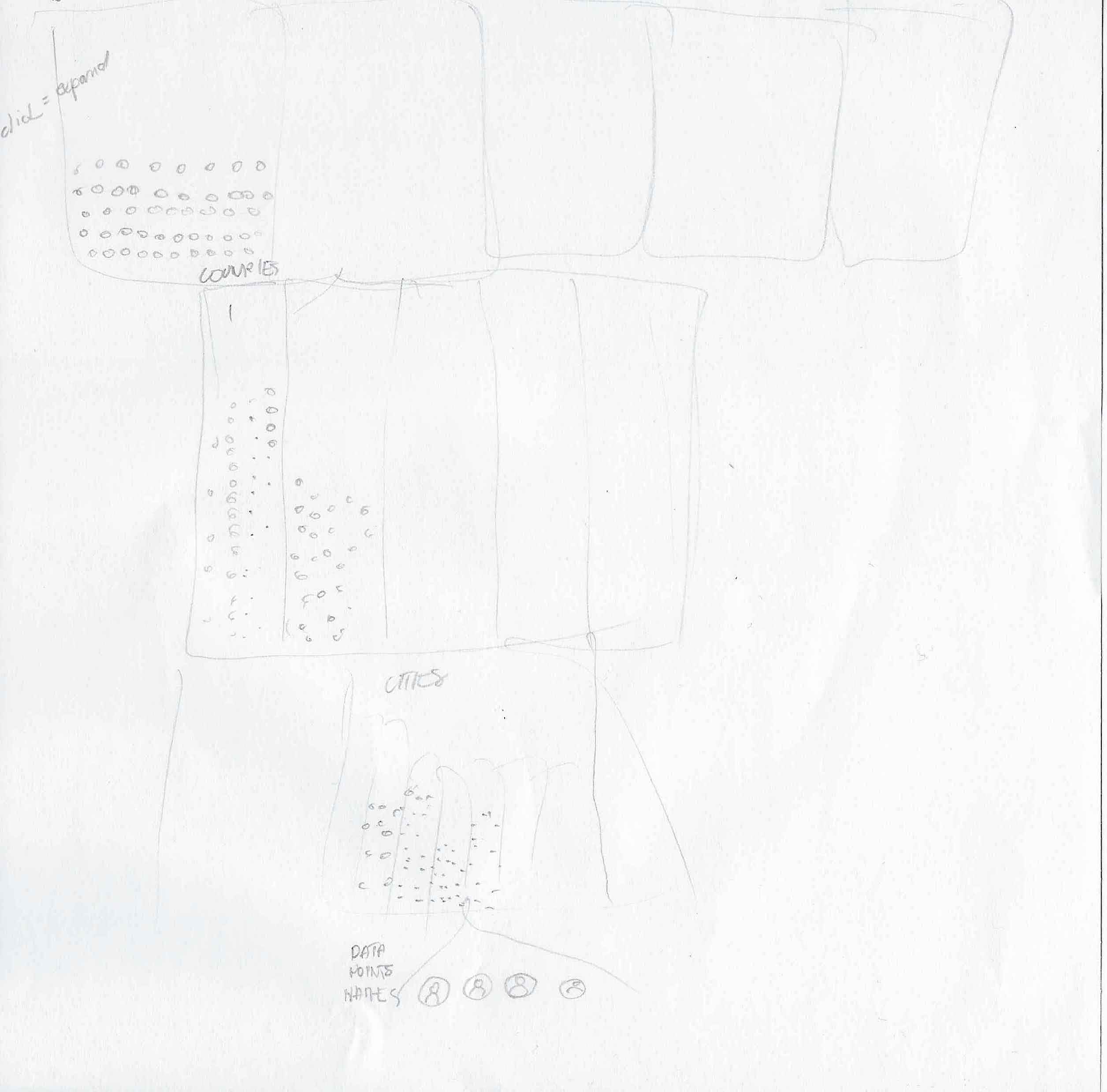
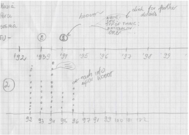
EXPLORING IDEAS THROUGH SKETCHING

IMPLEMENTATION WITH TABLEAU
Due to the limitations of the software changes had to be made to orginal design ideas and some work arounds had to be used, such as layering diferent graphs, which affected the usability of the filters.
USE CASE
By inspecting the visualisation users can generate and/or support a hypothesis. To illustrate this, let's take Turkey as an example.
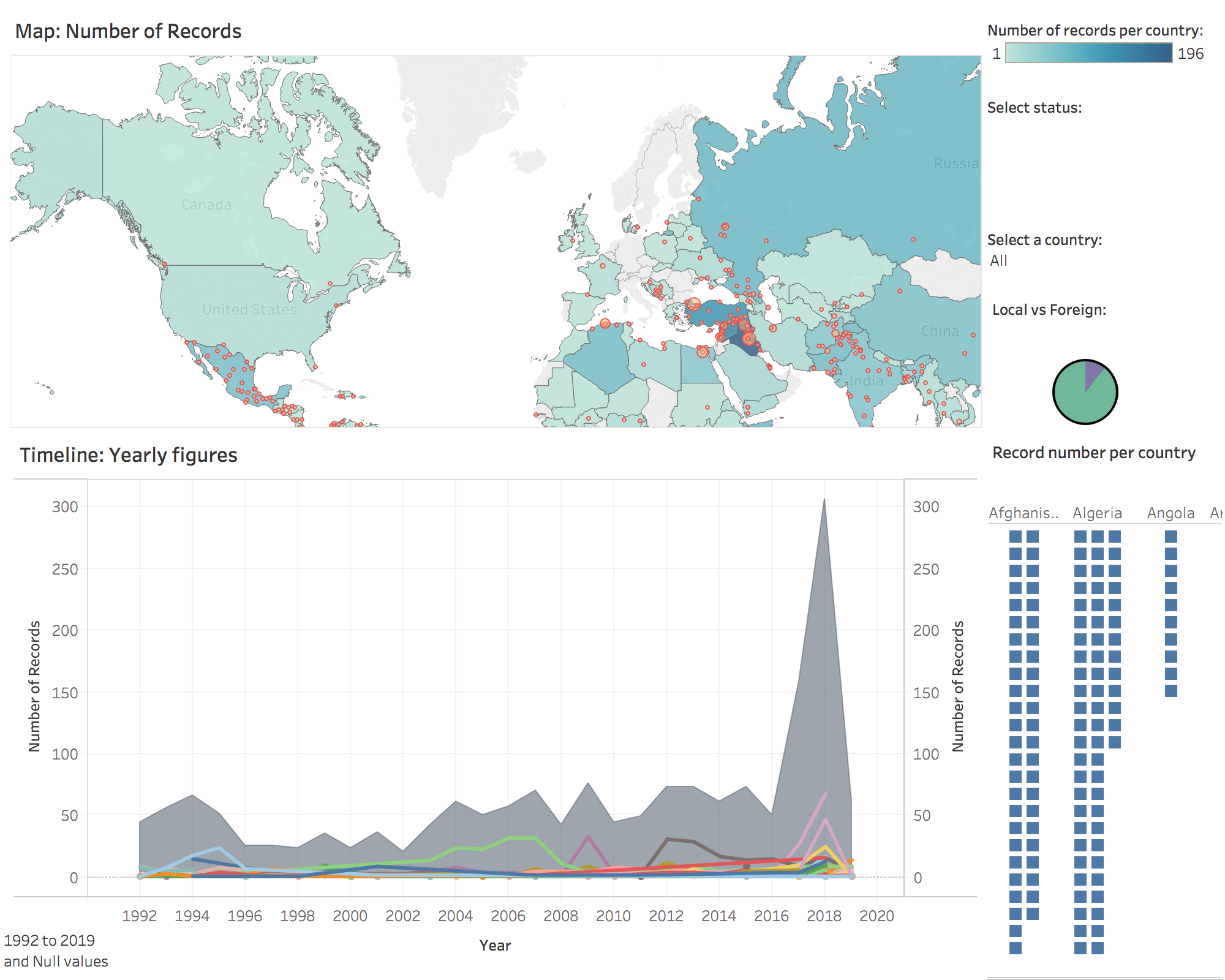
1. In the global overview map and the line graph, Turkey stands out as the country with the highest amount of cases. Comparison of the global and Turkey's trend lines indicates that Turkey shapes the global trend.
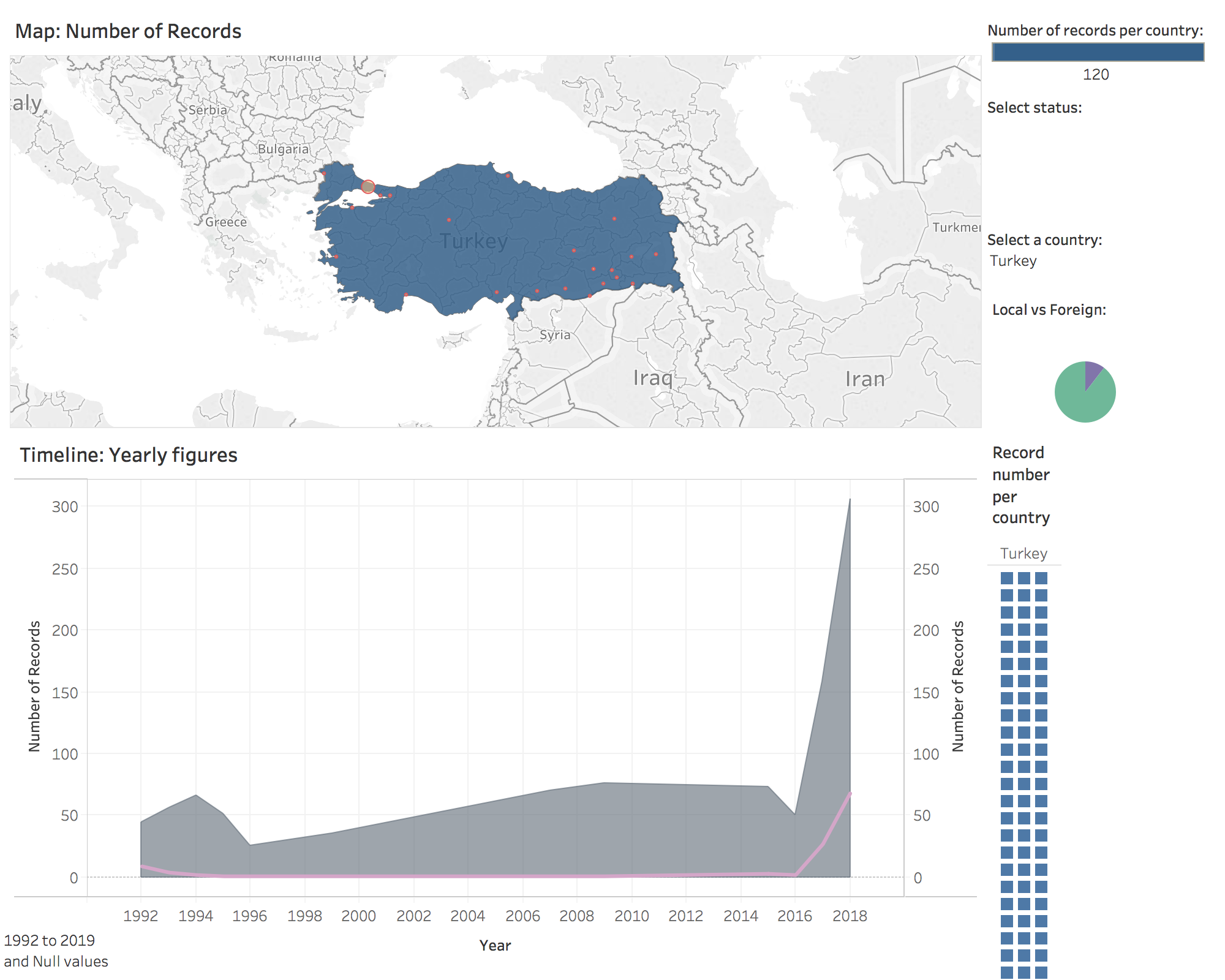
2. Upon a visual inspection of the line graph and an application of the country filter (Turkey) it becomes clear that the overall number of cases since 2016 jumped from 1 to 68. This allows to infer that some significant event occured in Turkey in 2016. This event was a failed coup attempt staged against the Turskish president Erdogan in July.
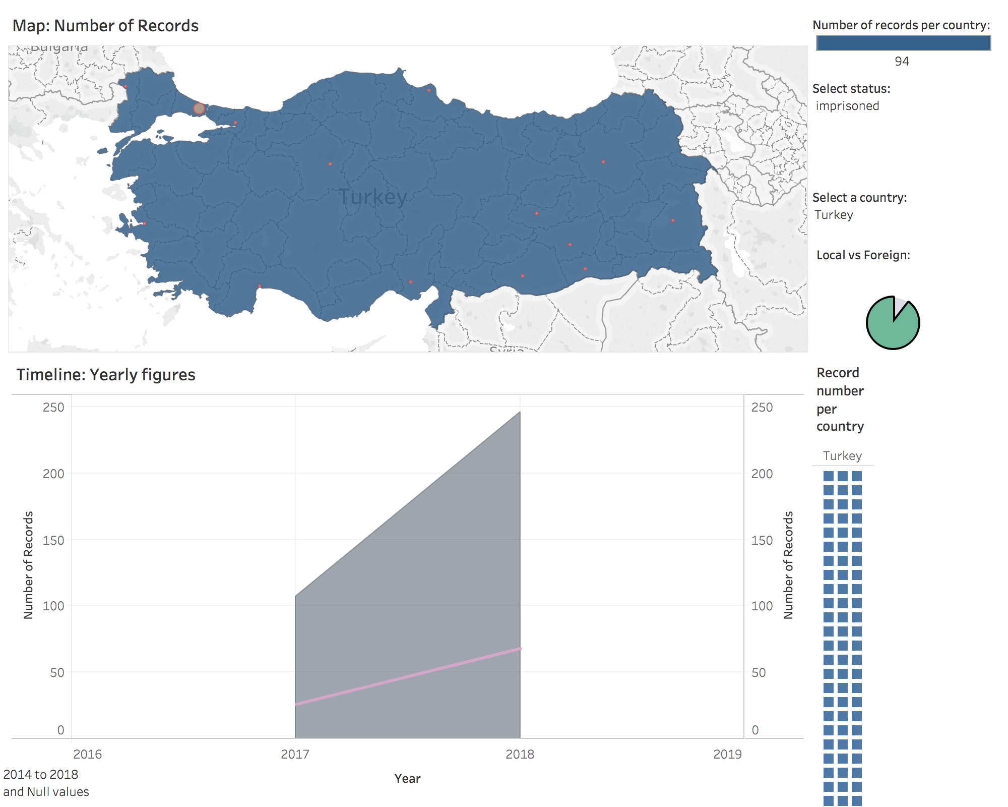
3. Experimenting with the application of missed/ killed/imprisoned category filters shows that all case since 2016 are imprisonment. This reflects mass arrests carried by the Turkish goverment after the coup attempt.
