Interactive Visualisation of Measles Related Data
OVERVIEW
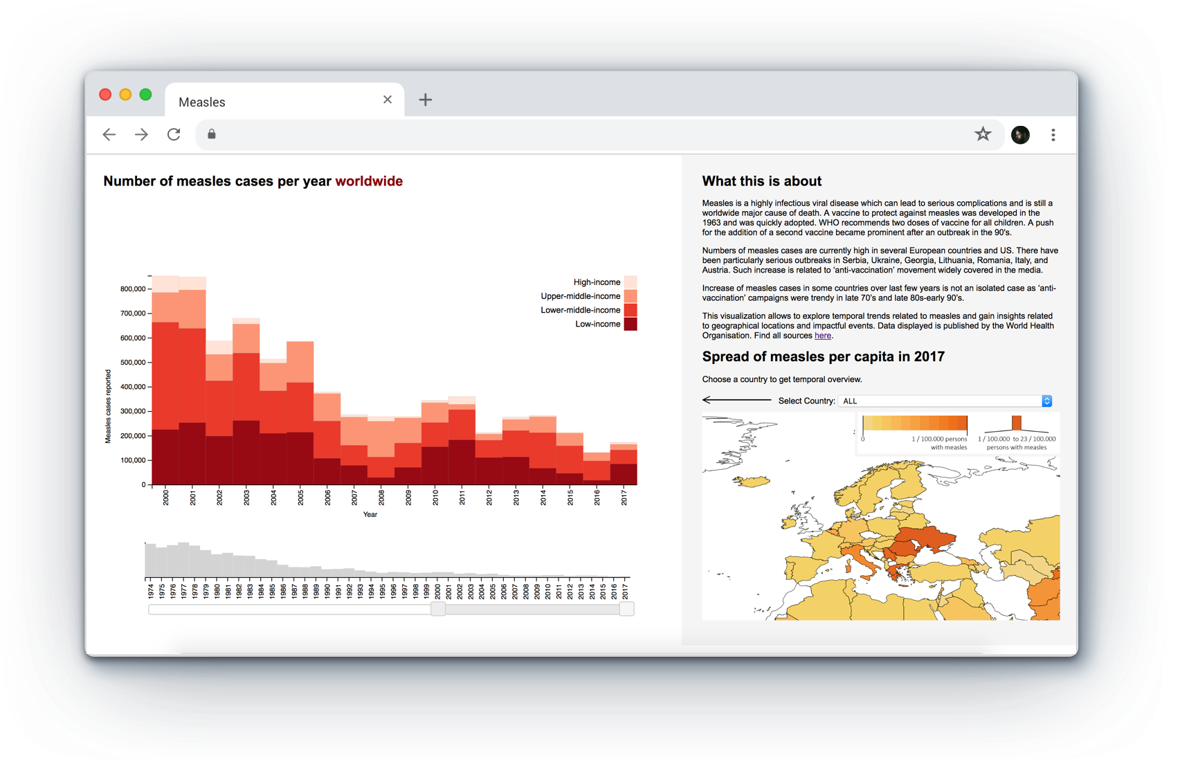
The visualization allows users to explore the temporal and geographical trends of measles and to generate insights into measles outbreaks. Data displayed is published by the World Health Organisation.
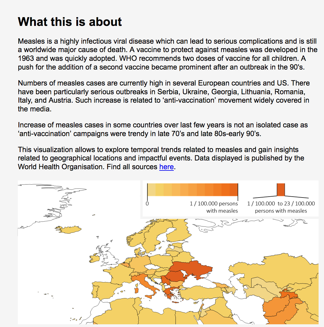
Problem: During the recent years, media has been reporting a surge in measles, often linking it to the MMR-autosm contraversy. In many cases, coverage surrounding measles outbreaks has been exaggarated and decontexualised causing a public confusion.
Solution: This visualisation allows users to explore official WHO data, such as vaccination rates and measles cases reported. It includes a global overview, interactive filters for ivestigating temporal and geographical trends and detailed information in tooltips.
Role: Ideation, sketching, prototyping, implementation.
Team: Agne Vaiciulaityte, Elisabeth Ettinger.
Tools: Tabeau, HTML, D3.js
DATA
The visualisation uses offical World Health Organisation and World Bank Data. Data sets include data on measles cases reported, vaccination immunisation rates (1st and 2nd vaccination shot) and countries' income.
USER GOAL AND QUESTIONS
User task goal for the visualization is to ‘discover’ the data. Accordingly, visualisation enables users to answer open-ended questions, such as how the number of measles cases changed in their country, have similar outbreaks been observed in the past etc. By using the visualisation users can generate and verify a hypothesis. The user goal and anticipated questions informed the design of the visualisation, its structure and interactive features.
In line with the user goal, the visualisation follows Shneiderman's data visualisation principle. First, it provides an overview of the data, helping users to orient themselves.Then, users can use time and country filters to zoom in on the data of their interest. Finally, more details can be accessed via tooltips. The system provides feedback to the users, so they can see which filters have been applied.
ATTRIBUTE VISUAL ENCODING
All data attrubutes have been analysed and the most approapriate visual encoding channels have been identified in order to make the visualisation perceivable. The table bellow summarasizes how the visual channels are justified.
| Data attribute | Attribute type | Visual encoding | Justification |
|---|---|---|---|
| Measles cases | Quantitative | Area | Effective channels according to literature. |
| Time | Ordinal | Position on a common scale | The most effective channel for displaying ordered data according to Munzer. |
| Income group | Categorical/ordinal | Color saturation and spatial region | Two channels are used efficiently: saturation is suited for display of instrincly ordered data attributes and the bars are ordered from low to high income. |
| Measles cases per capita (number of measle cases /population) | Quantitative | Color saturation | An effective channel for displaying quantitative data according to Munzer. |
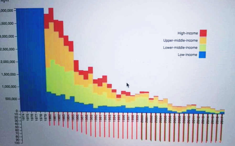
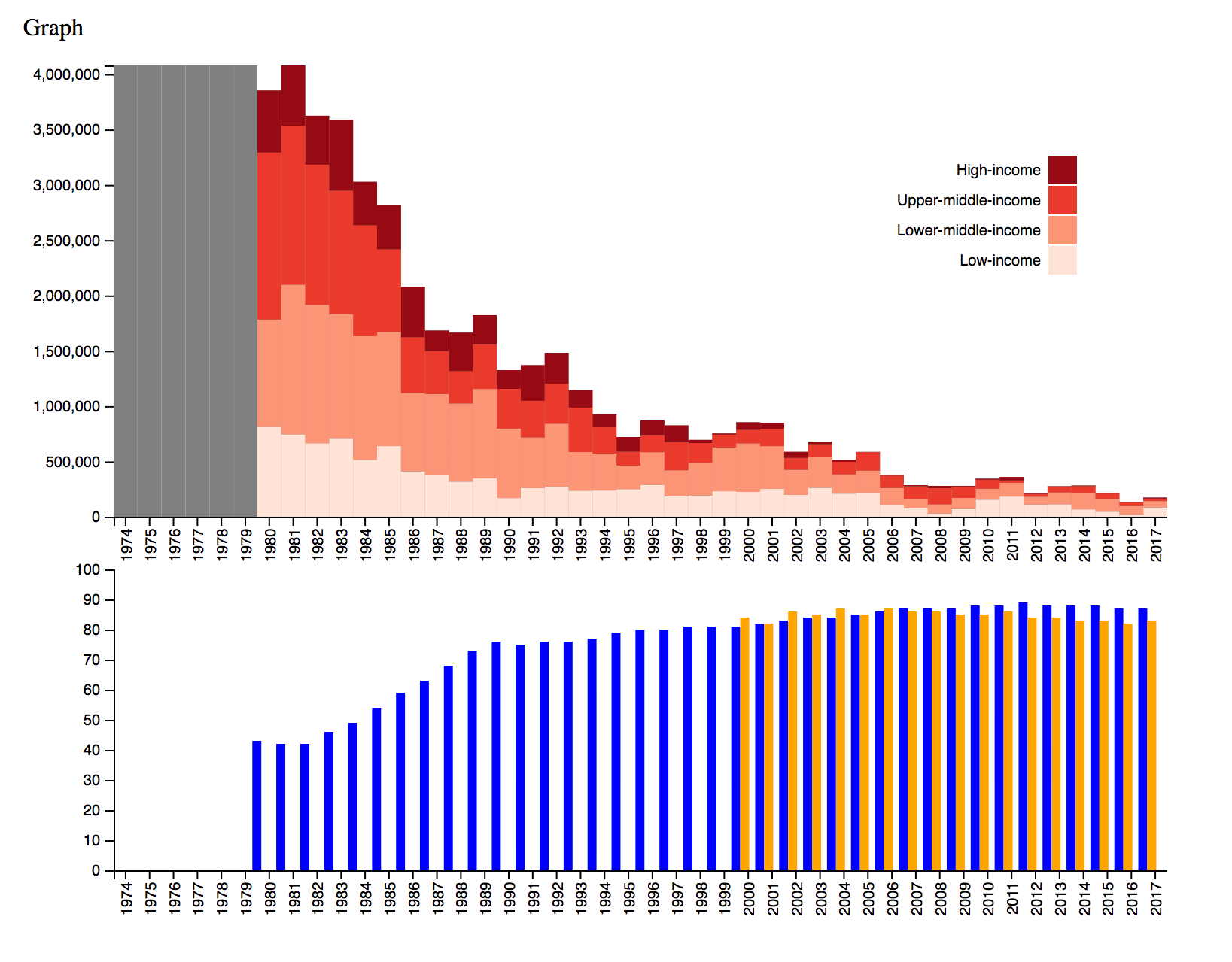
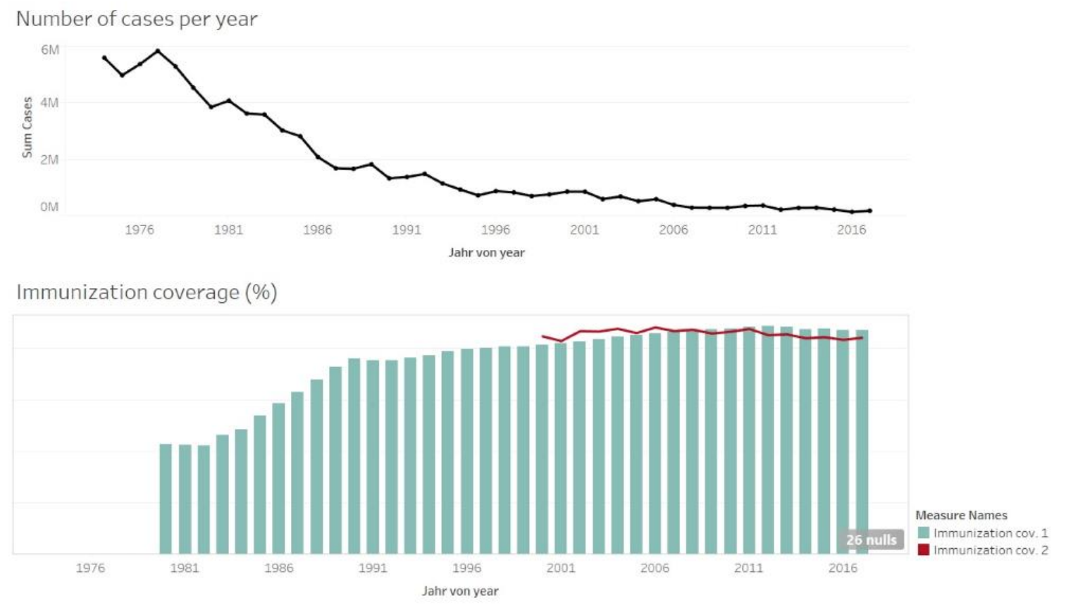
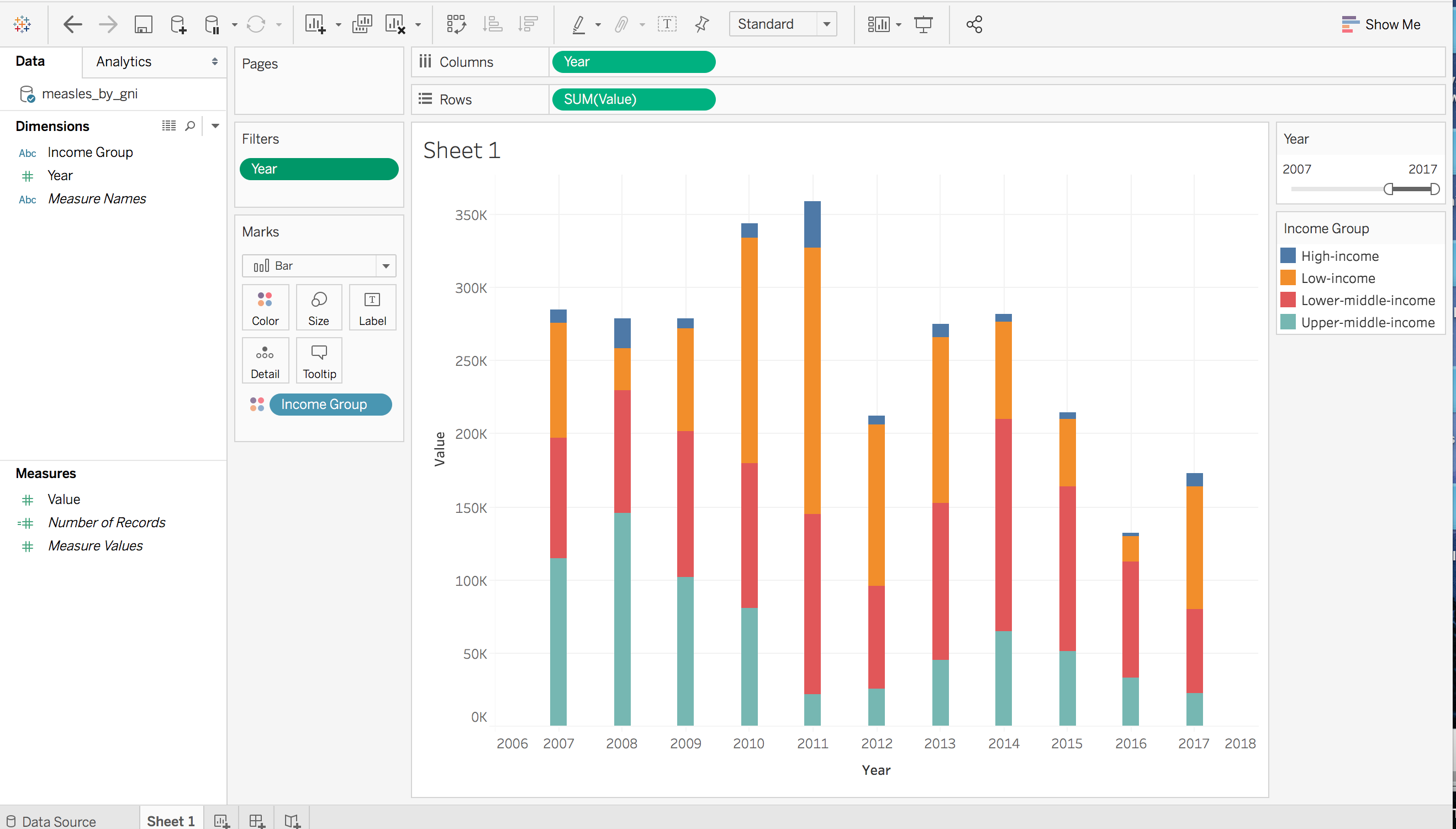
DISCOVERING DATA WITH TABLEAU
Tableau was used to sketch the data. It provided an insight into which paper sketches were effective for displaying the data and allowed to check data trends.
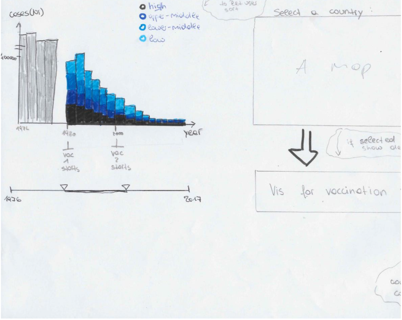
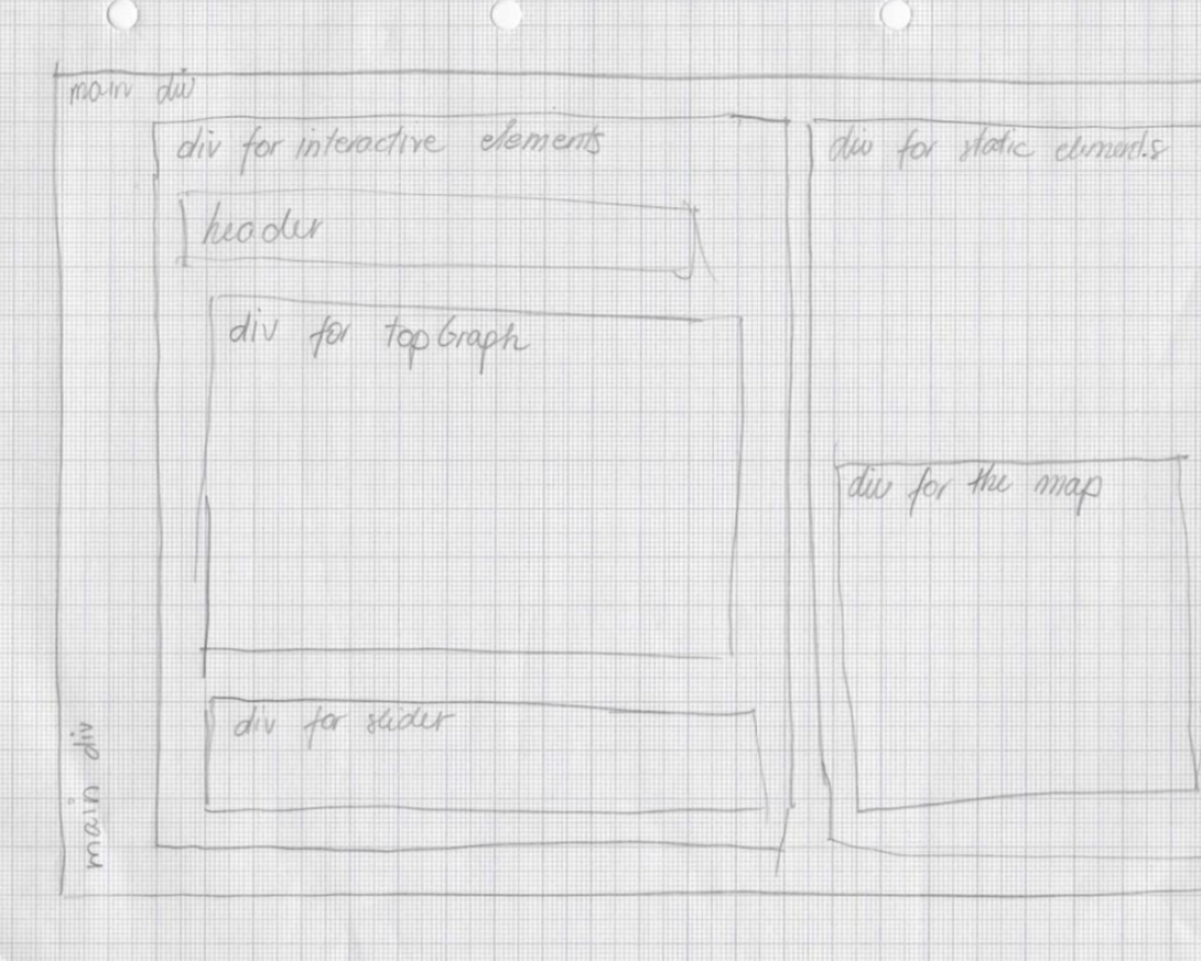
FINALISED SKETCH AND WEBSITE LAYOUT
GATHERING FEEDBACK AND ITERATING
After the main parts of the visualisation have been implemented, some guerrila testing was undertaken to gain user feedback. During those testing sessions, some participants found it difficult to follow the visualisation because they were unfamiliar with the subject matter. To solve the issue, a short introduction about measles was added at the top right of the website. Furthermore, participants struggled to understand a reversed graph representing immunisation coverage rates. As a result, the element was reveresed upside up.
More user testing followed in order to test whether changes implemented solved the issues discovered. Positive feedback was recorded about the majority of the changes, except for the bar graph representing immunisation coverage rates. Participants reported it as ineffective and unecesary, thus it was removed.